Great UX Is a Revenue Decision, Not a Design Decision
Users decide in seconds whether your product feels effortless or gets abandoned. How design quality directly shapes conversion, retention, and support costs.
Author
READ
Category

Users don't read interfaces. They scan them, judge them, and abandon them — often in seconds. Every confusing label, every extra form field, every "wait, where do I click?" is friction, and friction compounds. A checkout flow that loses a few percent of users at each step can quietly cut revenue by a third, and nobody notices why.
That's what makes UX a business metric, not an aesthetic one. Design quality shows up in numbers you already track: sign-up conversion, feature adoption, cart completion, support ticket volume. When those numbers disappoint, the interface is one of the first places to look — and one of the cheapest to fix.
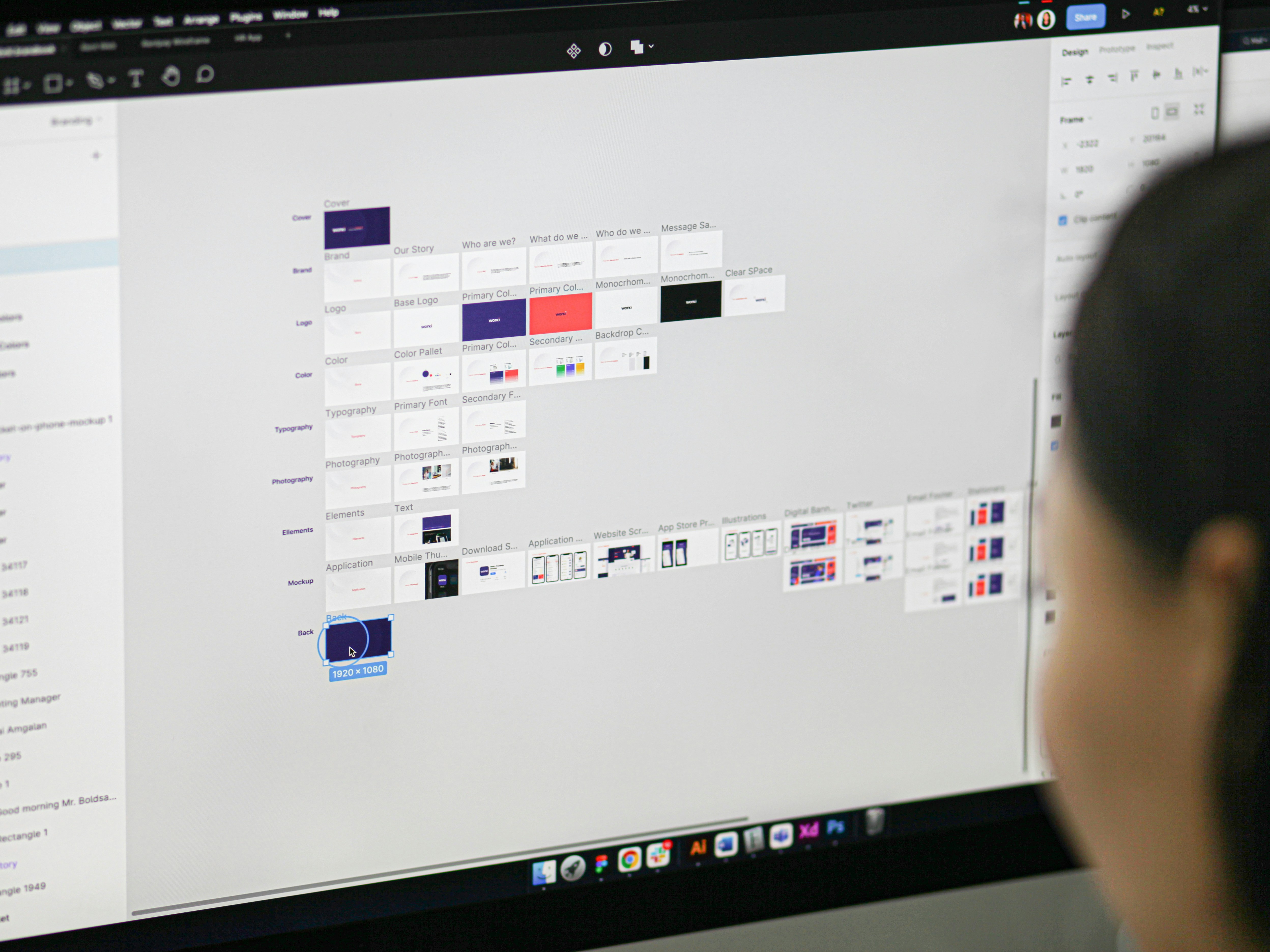

Good UX isn't guessed into existence — it's observed. Watching five real users attempt a task reveals more than fifty internal meetings, because users do things nobody on the team predicts. They miss the obvious button. They misread the label everyone agreed on. They find paths through the product that were never designed.
That's why design and engineering sit in the same room here. Wireframes get tested before code gets written, so expensive changes happen while they're still cheap — on a clickable prototype, not in a production release. By the time development starts, the guesswork is gone.

The payoff compounds over the product's whole life. Interfaces built on real user behavior need fewer redesigns, generate fewer support tickets, and earn the word-of-mouth no ad budget can buy. "It just works" is the highest compliment software gets — and it's always the result of deliberate design, never luck.
If your numbers say users are dropping off but can't say why, the answer is usually sitting in a usability session waiting to be found. Watch five users, take honest notes, and the priority list writes itself.