Klyro
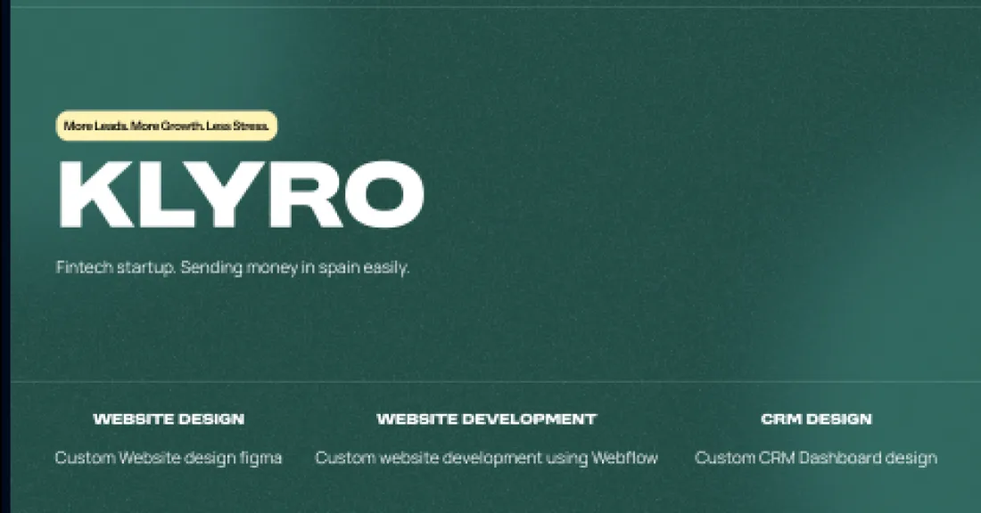
Fintech startup moving money into Spain
- Year
- 2025
- Disciplines
- Web design
- Webflow build
- Dashboard / CRM
The brief
Cross-border transfer is a fear purchase. Nobody is shopping for a nicer interface — they are deciding whether to hand a stranger sixteen hundred euros and trust it arrives.
The work
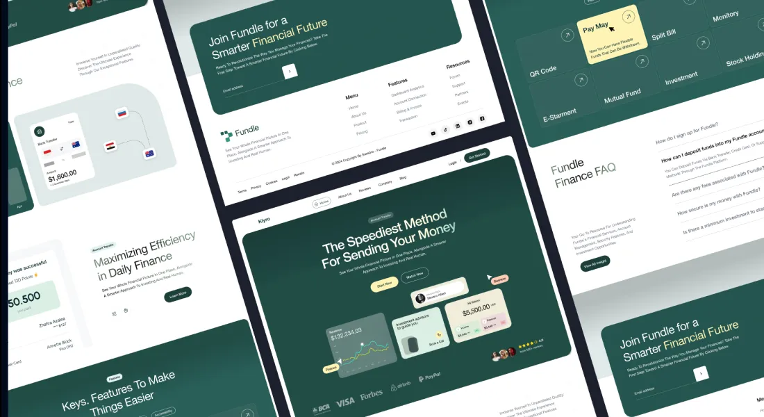
So the first screen shows the money moving. Amount, source flag, destination flag, arrival. Not an illustration of a globe, not a headline about borders — the actual transaction, drawn at the size it deserves. Everything else on the page argues from there.
The dashboard was designed alongside the marketing site rather than after it, which is the only way the two ever agree. What a visitor is shown before signing up is what they get once they log in: same balance cards, same transaction list, same typography. A product that looks different inside than it did outside starts every relationship with a small lie.
Calls we made
Deep green instead of fintech blue — the category has one palette and blending into it is not positioning.
The FAQ became a full section, not a footer link. Money questions are objections, and objections belong on the path.
Trust logos placed low, after the product has done its own arguing.