Product & app design
The screens someone opens every working day. Designed for the fortieth time they use it, not the first.
- Typically from
- $9,000
- Timeline
- 6–12 weeks
- Next step
- Book a 30-minute call ↗
Why this matters
A product is not a website with more buttons. A website is read once and then left. A product is opened every working day by the same person, who stops seeing the design within a week and starts feeling only the friction. That inverts what good means. The pleasure has to survive the fortieth visit, because the first one is not the one that decides anything.
So most of the work is subtraction. Which action happens forty times a day, and how short that path can get. What someone can finish one-handed, on a phone, standing up. What the screen shows before any data has arrived, which on a real connection is a good part of the time anyone spends looking at it.
What you get
Flows before screens
We map what someone is trying to finish before drawing anything. Product design that fails usually looks fine screen by screen, and falls apart the moment you follow one job all the way through.
Native patterns, not a site in a phone frame
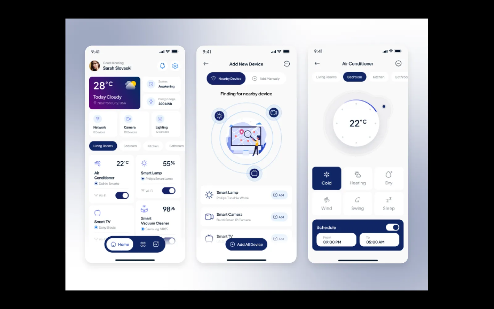
Platform conventions where the product is native: navigation that behaves the way the operating system does, system controls, gestures people already know. A translated web layout is the quickest way to make an app feel cheap.
Designed for the thumb
Reach, target size and one-handed use treated as constraints from the start rather than checked at the end. The action someone takes most often sits where a thumb actually lands.
The first five minutes
Sign up, the permission prompts, the empty account before anyone has done anything, and the moment the product has to prove itself. Most apps are uninstalled here, and it is usually the part nobody designed.
Handoff in the units engineers build in
Spacing, type and touch targets specified in points and density independent pixels rather than whatever the Figma canvas happened to be, so nothing gets converted by eye at build time.
The settings people actually change
Larger text, bold text, reduced motion, dark mode. People turn these on and never turn them off, and a layout that only holds at the default setting breaks for the users who needed it most.
How it runs
- 01
We start from the job rather than the feature list, usually by watching someone use the current product, or the spreadsheet and message thread it is replacing.
- 02
The two or three screens that carry the whole product are designed and agreed first.
- 03
Full interface design across the flows, every state defined, component library built as we go.
- 04
Handover to your engineers, and we stay reachable while they build.

Questions
Before you ask.
Do you build the app as well as design it?
No. We design the interface and hand over a component library your engineers build against. Application code is their work, and we would rather say that plainly than take the project and quietly subcontract it.
iOS and Android, or just one?
One properly first, usually whichever platform your users are actually on. The second is faster once the system exists, because the components and rules carry across and only the platform conventions change.
We only have an idea and no product yet.
That is workable. The first thing we produce is not screens, it is the flows, so you find out early whether the idea holds together as something a person can actually use.
How is this different from the dashboard work?
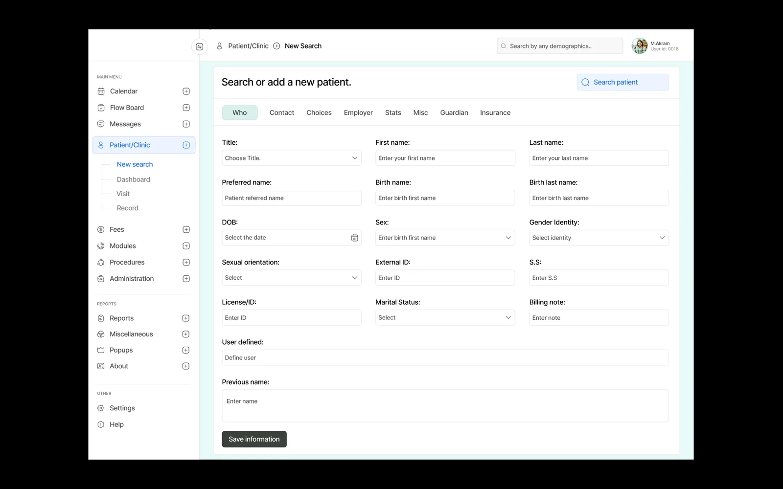
Mostly the surface it lands on. A dashboard is a dense interface someone works in at a desk with a keyboard. An app is used standing up, one-handed, on a connection that drops. The thinking is the same and the constraints are not.