The brief
A newsletter launch page has one job and about six seconds to do it. Anything that is not the pitch or the field is drag.
The work
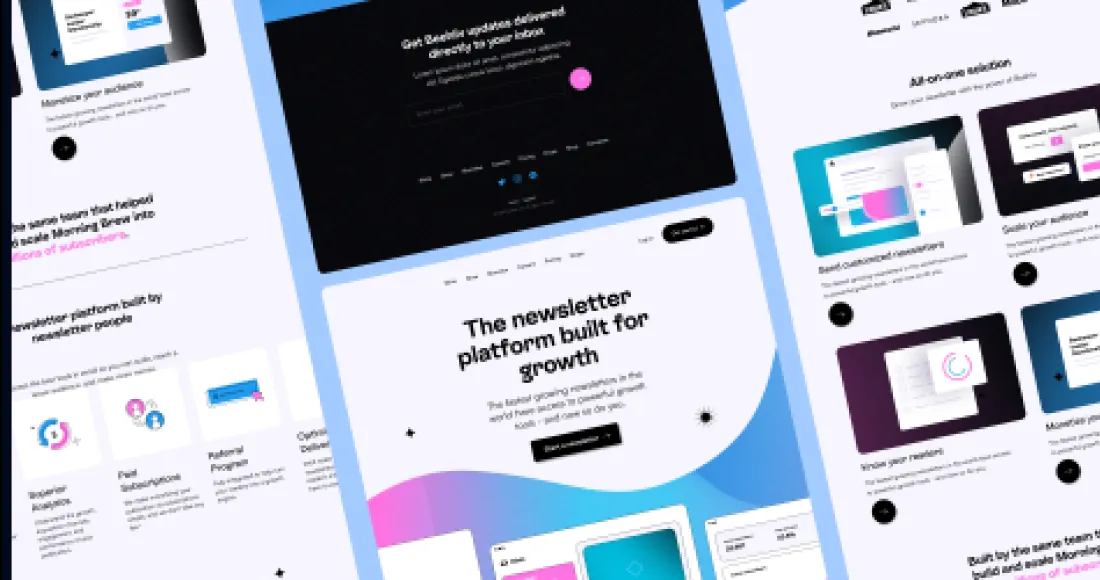
One screen. What it is, who it is for, what lands in your inbox and how often, then the field. No navigation, because there is nowhere else to go and offering an exit is a strange thing to design on purpose.
The restraint is the whole design. A page like this is won by what was left out, and most of the work was arguing things off it.
Calls we made
01
Email field visible without scrolling on every viewport we tested.
02
Cadence stated up front — people subscribe to a frequency as much as a topic.
03
No navigation bar. A single-purpose page should not offer a way out.