Calendar
Task and calendar app
- Year
- 2024
- Disciplines
- Web design
- Webflow build
- Live build
- Visit the site ↗
The brief
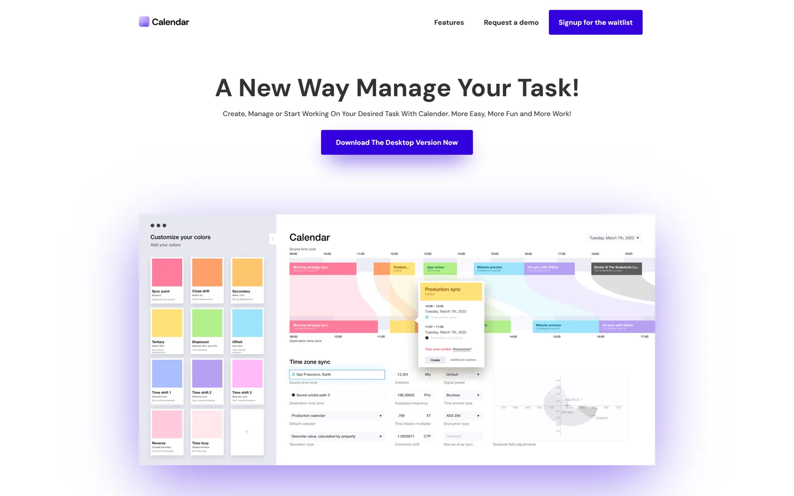
A pre-launch waitlist page, built from a design handoff. The build had to hold the designer's spacing and motion honestly rather than approximate them and hope nobody measured.
The work
Straight Figma-to-Webflow, with the interface renders reproduced at full fidelity — the entire pitch of a scheduling app is that it looks calm, and a build that drifts from the design undoes exactly that.
Scroll-triggered reveals were kept slow and small. On a productivity product, motion that shows off makes the software feel busy, which is the opposite of the promise.
Calls we made
Spacing scale taken from the Figma file rather than eyeballed at build time.
Reveals capped short, and disabled outright under reduced-motion.
Waitlist field repeated top and bottom — the only two places anyone commits.