Open-EMR Hospital Dashboard
Hospital records and patient management
- Year
- 2025
- Disciplines
- Product design
- Dashboard / CRM
The brief
Medical records software is where interface design stops being decorative. A clerk enters a patient's details while that patient stands in front of them, and a field in the wrong place becomes a queue.
The work
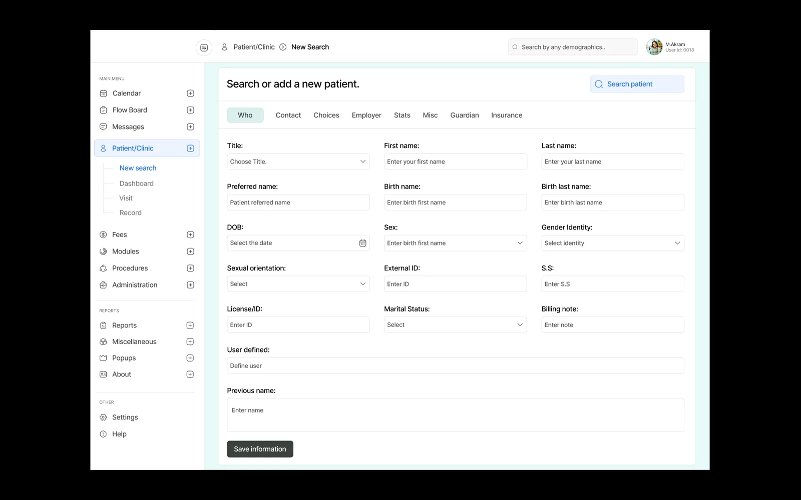
The intake form was organised the way the conversation actually goes — who you are, how to reach you, who pays — split across tabs so no single screen becomes a wall. Roughly forty fields, and the design's whole job is making forty feel like eight.
The left navigation exposes the full system without expanding into a menu that has to be hunted through. Clinical staff learn one path and use it for years; discoverability matters far less here than never moving anything.
Calls we made
Labels above fields, always. Placeholder-only labels vanish the moment typing starts, and in records entry that is a real error.
Tabs rather than a single scroll. Sectioning a long form is the difference between finishing and abandoning.
Sex, gender identity and orientation given separate, plainly-labelled fields — accuracy in records is not a style question.
Near-white ground with one accent. Clinical software is looked at for nine hours at a stretch.