Carbique
Consumer beverage launch
- Year
- 2024
- Disciplines
- Web design
- Webflow build
- Live build
- Visit the site ↗
The brief
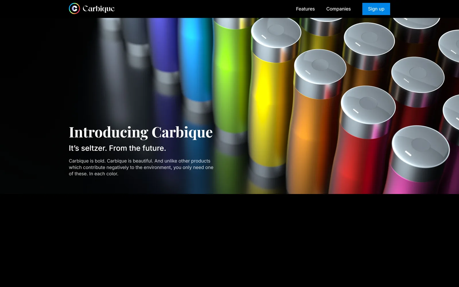
A drink nobody has tasted, sold on a screen. The only asset that can do any convincing is the product photography, so the layout's job was to get out of its way.
The work
Black ground, full-bleed render, serif headline set small against a very large image. The bottles carry every colour on the page; the interface contributes none. That discipline is what makes the product look expensive.
Everything below the fold is short. Consumer launch pages lose people in paragraphs, so the copy was cut to the few lines that survive a skim.
Calls we made
Zero interface colour. The product supplies the entire palette.
Serif display against sans body — a small friction that reads as considered rather than generated.
One signup, no account creation. Nobody registers to hear about a drink.