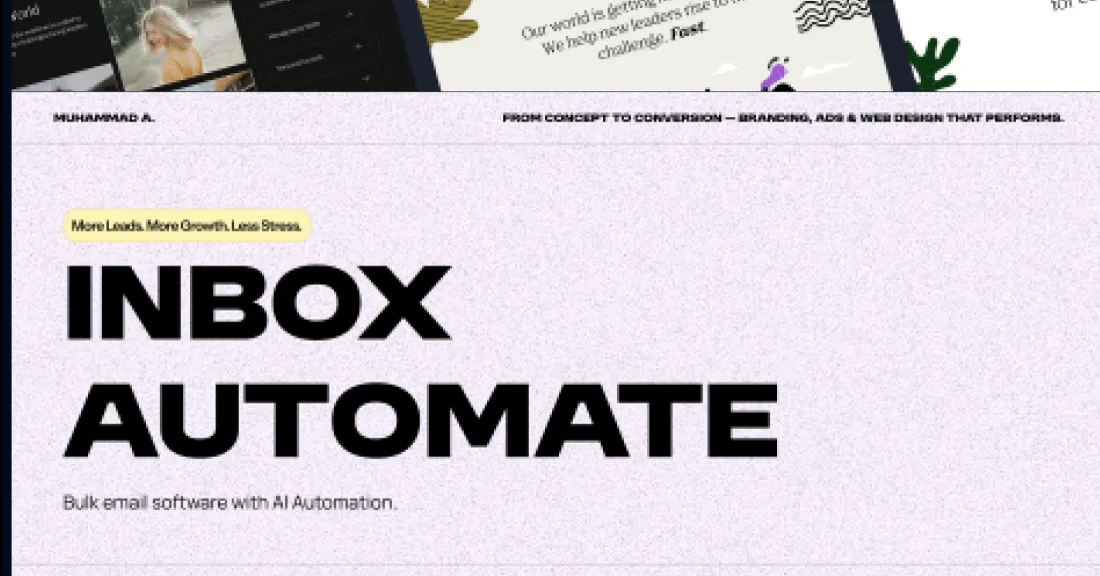
The brief
Automation products fail at the same point: the visitor cannot picture what changes on Monday morning. Feature lists make that worse, not better.
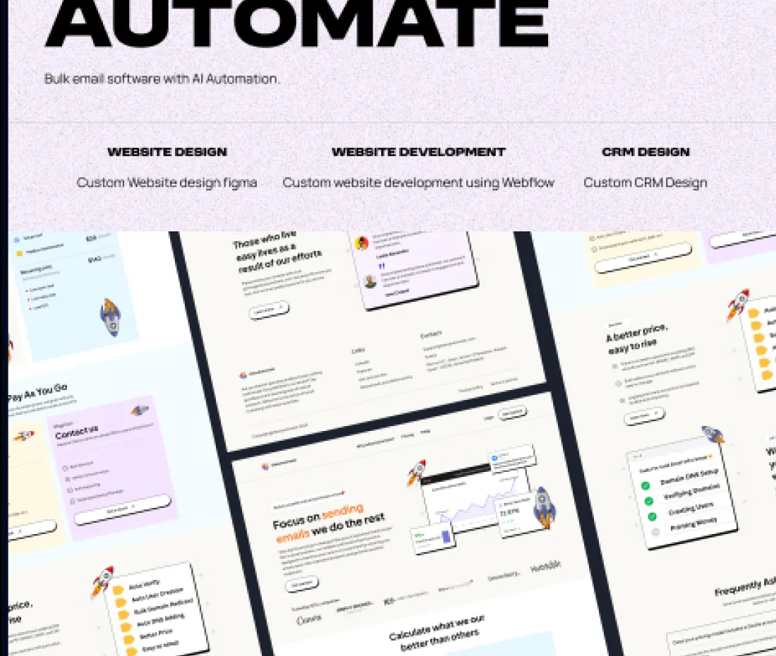
The work
The page is built as a sequence — mail arrives, rule fires, thing happens, inbox is quieter. Read top to bottom it is a demonstration rather than a description, and it holds together for someone who has never used a tool in this category.
Light ground, generous air, and screens shown at a size where you can actually read the interface. Shrinking a product screenshot to fit a marketing layout defeats the only job the screenshot has.
Calls we made
One workflow shown end to end beats six shown partially.
Interface screenshots kept large enough to read the labels.
Sign-up asked for once, at the bottom, after the argument is complete.