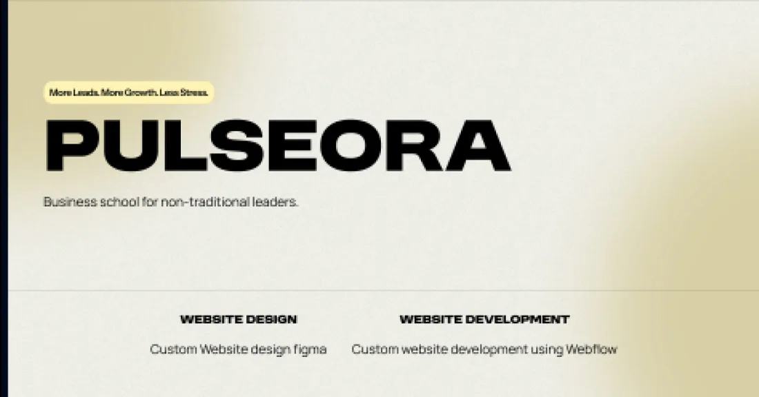
Pulseora
Business school for non-traditional leaders
- Year
- 2024
- Disciplines
- Web design
- Webflow build
The brief
The audience is thirty-eight, mid-career, and has been condescended to by education marketing before. Campus photography and words like 'journey' would have lost them on the first screen.
The work
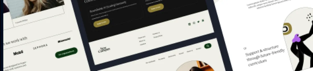
We built it to read like a considered publication rather than a prospectus — warm paper tone, generous measure, type doing most of the work. The restraint is the argument: this is a school for adults, and it looks like one.
Programme structure was made scannable early, because a career changer's first question is logistics, not philosophy. Cost, length, and how it fits around a job, stated before any of the aspiration.
Calls we made
No stock photography of people looking pleased in atriums.
Cream ground rather than white — softer for long reading, and it separates them from every other school site.
Enquiry form kept short. This audience abandons long ones and does not come back.